
- Lightroom Editing Guide: From RAW File to Cinematic Photo Style
-

Hello!
We've noticed that you are in .
Visit Canon .
In the world of photography, creating a unique and recognisable style is key to standing out. Whether you're a seasoned professional or an enthusiastic hobbyist, Adobe Lightroom offers powerful tools to help you achieve a consistent and cinematic look in your photos.
In this article, we're diving into a complete Lightroom workflow from photographer Mitch Adoh – including how he edits Canon RAW files, creates custom presets, colour grades with precision, and maintains consistency across his portfolio. You’ll also find an embedded tutorial video where Mitch walks through this process in real time.
Mitch has been shooting for around 4–5 years, focusing on portraits, fashion, and automotive photography. He's passionate about creating images that feel like they could be part of a movie – with colour playing a major role in bringing his work to life.
Mitch go-to gear includes the Canon EOS R6 Mark II and the Canon EF 16–35mm f/2.8 and RF 24–70mm f/2.8 lenses, which help him capture stunning visuals with rich colours and dynamic range. As he expands into street and travel photography, Mitch continues to refine his editing techniques and share his cinematic aesthetic with other creators.
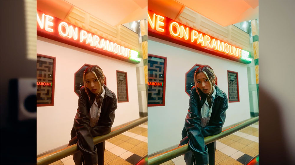
Having a consistent look to his colour grade and my overall style has helped his work become more recognisable.
• Always shoot in RAW – It gives you the most dynamic range and highest quality possible, which lets you push the image so much further in the edit.
• Good lighting is key – It’s much easier and much faster to edit a shot that’s been lit properly. Learning how to light your photos will dramatically improve your workflow.
Adjust the white balance and exposure, drop the highlights to retain detail, and bring up the shadows and blacks to add depth. Adding texture and reducing clarity can create a dreamy effect, especially when combined with a mist filter.
Start by importing your RAW file. Here are some of the first adjustments Mitch makes:
• White Balance – Typically lowered to cool the image slightly
• Exposure – Reduced to bring back highlight detail
• Highlights – Dropped to preserve details in bright areas like neon signs
• Shadows – Increased to reveal more mid-tone depth (usually around +50)
• Blacks – Lifted slightly (around +35) for a soft, airy contrast
• Texture – Added to maintain detail in edges and fabric
• Clarity – Reduced to -5 or more to enhance glow and softness
Mitch also uses a mist filter on the lens during shooting, which enhances that dreamy, cinematic glow and works beautifully with the reduced clarity and soft tonal adjustments. These early edits set the foundation for the cinematic mood that defines his style.
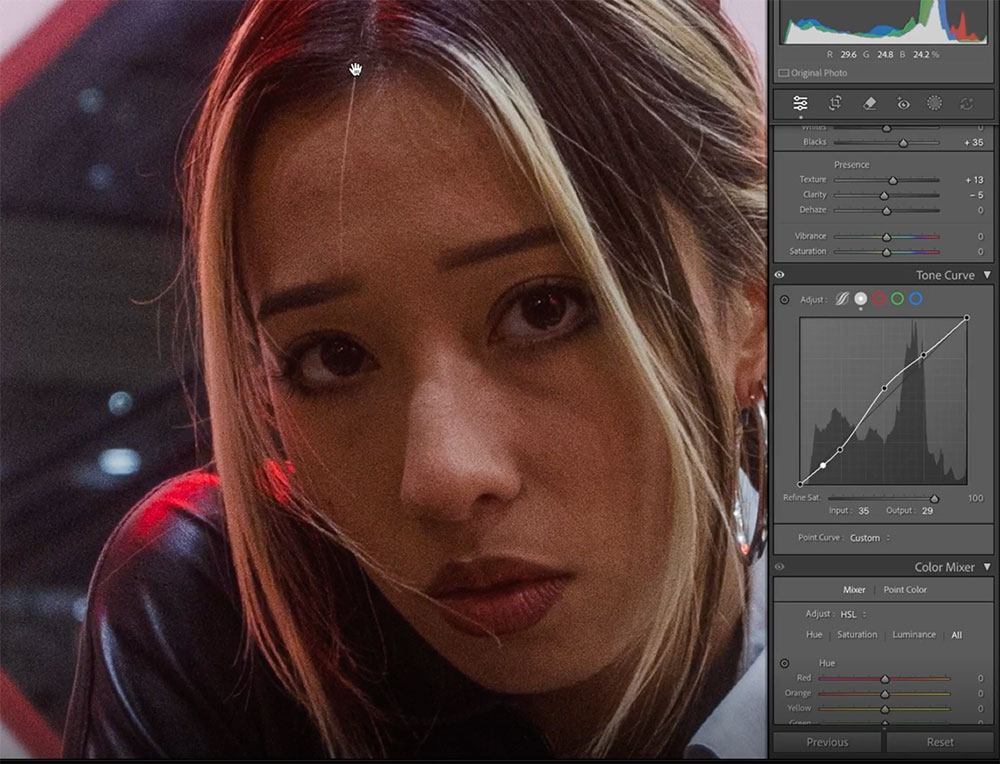
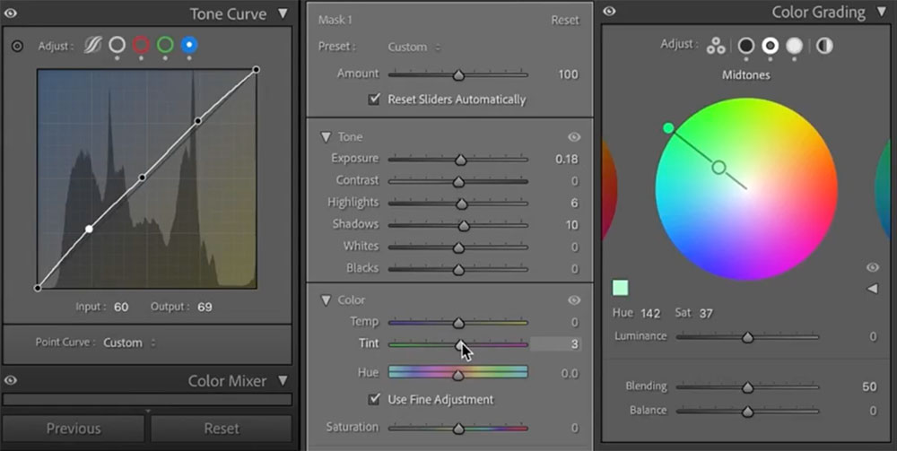
The tone curve and calibration tools are central to Mitch’s ability to build depth and mood in his images. The curve allows him to control contrast precisely, while calibration helps apply global colour shifts that enhance overall tone.
Tone Curve Adjustments:
• Raise highlights and mid-tones to bring vibrancy into the image
• Gently lower shadows to retain contrast
• Slightly lift blacks to prevent crushing dark areas like jackets and hair
“I raise the highlights and mid-tones, then drop the shadows ever so slightly. I also raise the blacks a bit to bring back detail in the jacket and eyes.”
Calibration Settings:
• Add magenta tones into the shadows
• Increase red hue to +25 and red saturation to +20
• Push the blue hue toward teal, with a light saturation increase
• For night shots, Mitch avoids tweaking green calibration heavily
“Calibration creates global adjustments instead of localised ones – which makes it one of my favourite tools for shaping colour across the whole image.”
Together, these tools allow Mitch to introduce a cinematic warmth and a subtle colour shift that gives his photos a polished, stylised look.
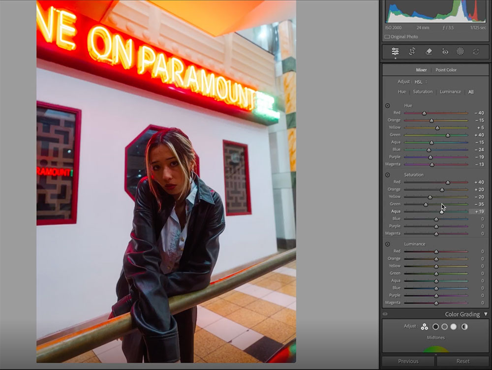
The HSL panel is where Mitch fine-tunes specific colour ranges to get the final tonal balance right. It’s a process of refinement that allows him to highlight key colours and mute distractions.
Hue Adjustments:
• Reds – Shifted toward orange (around -40)
• Yellows – Slightly boosted or lowered depending on the mustard tone desired
• Greens – Pushed toward teal
• Teals & Blues – Adjusted to harmonise with the teal shadows
• Purples & Magentas – Slightly lowered to remove colour cast
Saturation Adjustments:
• Reds & Oranges – Boosted to make skin tones pop
• Greens – Dropped to avoid overpowering the frame
• Yellows, Purples & Magentas – Reduced to keep the focus on the subject
Luminance Adjustments:
• Reds & Oranges – Lowered to make tones feel richer and denser
• Blues & Aquas – Raised to create contrast
• Greens – Reduced to remove excess glow
• Purples/Magentas – Dropped to minimise colour cast on walls
“A lot of what my editing process is is just playing around with the sliders and seeing how they affect the image.”
This combination of global calibration and local colour tweaks is key to Mitch’s signature cinematic tone.
Colour grading wheels are one of Mitch’s go-to tools for creating colour contrast and building a strong mood.
• In the Colour Grading panel, he adds green and teal tones into the shadows, midtones, and highlights (typically around 130–140°)
• This builds a stylised atmosphere and separates the subject from the background
“My favourite way to create colour contrast in my image has been the colour grading wheels – I love it, it makes my life so much easier.
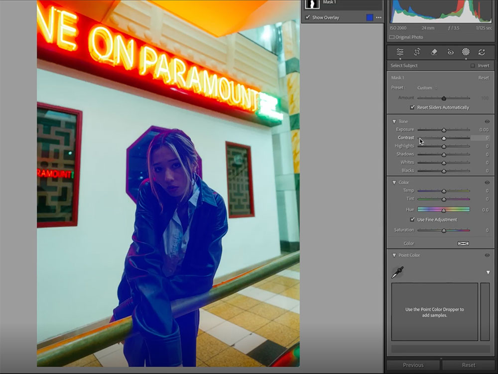
Subject Mask:
• Boosts exposure and shadows to ensure the subject stands out
• Used especially when the subject is underexposed compared to the background
Background Mask:
• Slightly darkens the background to create separation without making it obvious
• Helps lead the eye to the subject
“The background is distracting, so I darken it just enough that the subject pops more.”
Once the main grade is done, Mitch adds the finishing flourishes:
• Tweak RGB Curves:
• Add lift to the red and blue channels
• Introduce green for balance
• Use point curves to stylise shadows and highlights
• Contrast – Dropped slightly (e.g. -20 to -40) for a flatter, filmic finish
• Temperature – Increased slightly for warmth
• Sharpening & Grain – Applied for a softer, textured effect
• Clarity – Often reduced again at the end for glow
“Then I bring some warmth into the image – that’s what it was missing. I drop contrast, adjust blacks, then fine-tune my subject mask again to balance out skin tones.”
Once you’ve honed a look that reflects your creative style, Lightroom presets can help you lock it in. They allow for a repeatable editing framework, especially when you’re shooting in similar lighting or environments. Over time, many creators find that they start composing and exposing their images with their preset in mind – editing becomes faster, and the results feel more intentional.
To create a preset in Lightroom, start with an image you're happy with. Click the + button in the Presets panel, select Create Preset, and tick the settings you want to save (Mitch recommends including almost everything, even masks). Name the preset and save – it’s now ready to apply across other shoots.
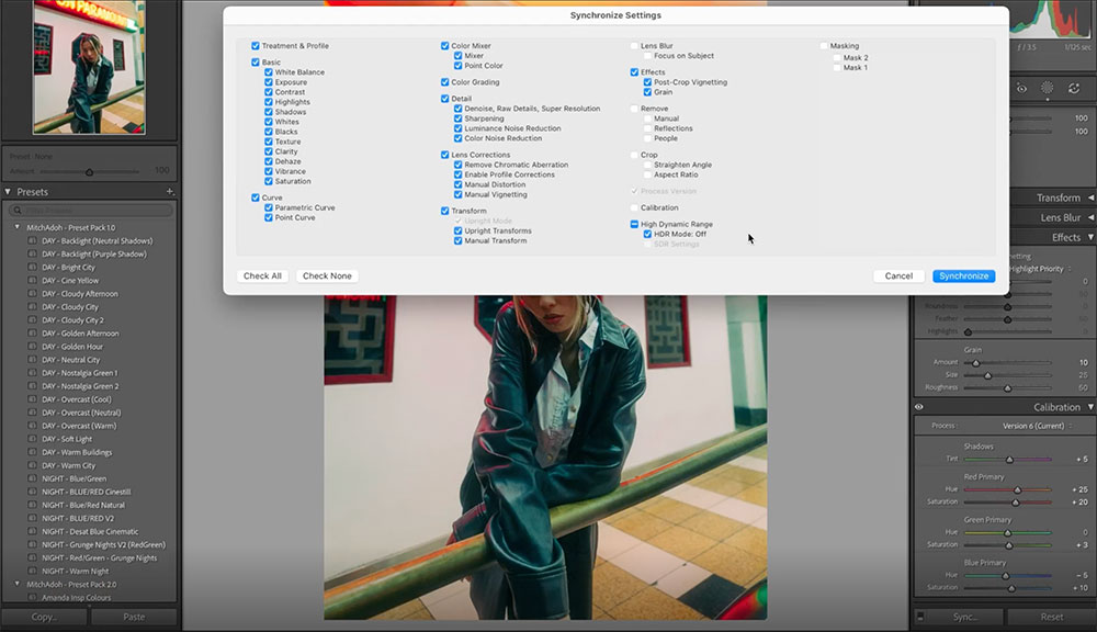
For editing batches of images, the Sync function in Lightroom is a powerful time-saver. Select your edited photo, hold Command (Mac) or Control (PC), then click on the other images you want to match. Click Sync, choose the settings to apply, and Lightroom will update them all at once. This is especially useful when working with social media content, where visual cohesion across a grid or carousel matters.
Having a consistent editing style is crucial for several reasons:
• Recognition: A unified style makes your work instantly recognisable, helping you stand out in a crowded market. Even if people don't know you yet, they might come across your work multiple times and begin to recognise it as yours.
• Stronger Storytelling: Consistency helps maintain viewer immersion, ensuring that your editing style flows seamlessly throughout your work. This cohesion is vital for storytelling, especially when creating a series of images.
• Client Trust: Clients often hire photographers because they appreciate their style. A consistent look reassures clients about what to expect, building trust and meeting their expectations.
By mastering these Lightroom techniques, you can elevate your photography and build a consistent, cinematic style that sets your work apart. Watch Mitch’s tutorial video for a hands-on demonstration of these tips, and start applying them to your own photos today. Whether you're editing Canon RAW files or creating your own presets, these skills will help you achieve stunning results and make your work more recognisable. Happy editing!
Mitch Adoh is a portrait and lifestyle photographer based in Australia, with growing interests in street and travel photography. With 4-5 years of experience, he’s known for cinematic visuals that blend moody lighting, soft tones, and bold colour work. His favourite editing tools? The tone curve, colour grading wheels, and calibration panel – for unmatched control over mood and story.